 This is the week of the alpha, which also means the week of small fixes on everything from enemy projectiles to the background and while this takes up a lot of time I did continue my work on the GUI and even started working more on the HUD. I used the work I did the previos week with the menu concept regarding papers, love letters and things like that. Due to the fact that we are currently deciding what kind of font we should use I haven’t written the letters or text that we should use just yet. However I’m almost entirely done with the main menu now.
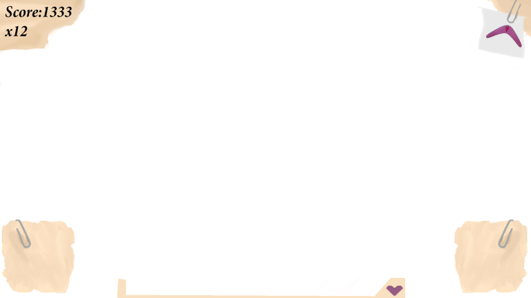
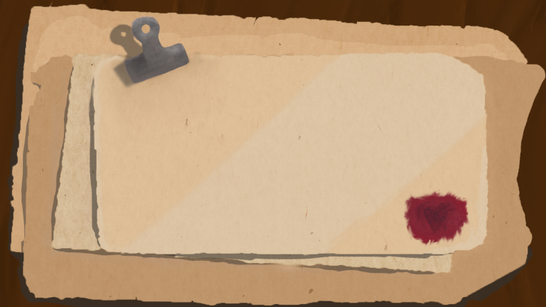
I started to research how old papers, books, quills looked and what I wanted to have in the scene. I wanted the whole scene to look a bit rustic and a little bit ruined.So after looking around for a bit and testing different ways. One thing i started on was having a paper on the left side and a quill and a candle on the right, but I didn’t really like that too much. I also tried drawing a paper wtha quill on it but it didn’t end up too well either.
One thing I really did like however was when i used a stack of paper and colored them in slightly different colors and after shadow to them it actually looked good. However something was missing, a stack of paper looked way too boring. In the end I used a clamp in the top of the papers, making it look like it’s holding them together. Under all this I added a wooden table, to have some sort of background.
However they looked a little to colorless and simple for my taste and there is one very simple answer to this and that was adding a texture on top of every paper. This added some sort of variation to the papers and made them look more realistic. As I mentioned earlier I didn’t finish writing any menu, I started with some different letters but in the end I skipped that.
Now it’s going to sound like I’ll never be happy with this menu, but I still felt some color was missing in the scene. Tere was way to much brown/beige. Here I went back to the first menu, and once again tried to add these wax stamps and drawed one in one of the corners of the top paper. Inside this stamp I used a slightly darker brush to draw a heart and then the mixer tools to smudge out the edges. Now I will not go as far as saying that the menu is perfect, but atleast Im happy enough to work on the letter now instead of adding more and more content on the background.

Hello Fabian!
Aside from a few grammatical errors that is easy to see past, your post explains what you have done. However there is a lack of a line of thought. You do describe how you changed the color of the papers to make them feel a bit more alive and realistic, together with with textures you have added.
You do mention that you researched older materials, however i find no connection or description on what you took from your research and applied to your work.
Just looking at paper my first thought was “how come the paper is darker around the edges”.
I did a quick google search and found out that it is indeed the way it looks. But i would have liked it to be explained in your post. I would also like to point out that the contrast is a bit too strong and makes it look unnatural.
Taking a quick look at your pictures, i can see the HUD, but no comment about it.
I would however like to comment on it. First off the simulated paper looks nothing alike the menu does. And the placement of all the elements are too far apart and makes my eye wander off the important stuff. However, as you have not mentioned anything about this picture, i cannot say where the important stuff should be located.
Just as a quick example, i do seem to be able to read a health-bar on the bottom, which i do want to keep track on, and a power-up in the top-right, which i also want to track on.
Assuming the action is in the middle and the important information would be on the sides, and more than one side, i would not be able to keep my eye on everything, which prevents me from playing the game and makes me rather want to have no information at all.
When it comes information, it would be better to keep them together as long as it is relevant to the situation.
// Oskar Kervefors
GillaGilla